bathe in salt
/graphic design/ /packaging/ /re-branding/
packaging design class project | 2019 - 14 weeks
![]()
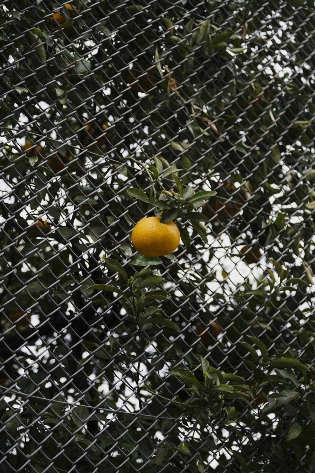
/current Morton Salt packaging & logo
/graphic design/ /packaging/ /re-branding/
packaging design class project | 2019 - 14 weeks
/Morton Salt Rebrand:
expanding to bath product line; a new brand identity for Morton Salt, a well know North America's leading producer and marketer of salt./
/current Morton Salt packaging & logo

/The existing brand is not distinctive, blends in with others, and shows too much variance as a family. Morton Salt did attempted to rebrand and update the Morton Salt girl. However, they seems to fall behind with its brand image, keeping connected with the current trend and young cookers.

/In 2013, Morton Salt expand from kitchen to bath with epson salt, creating the perfect opportunity for them to branch out and create a sub-brand with the new line of bath/skin-care products; offering a completely new look and feel.
/concept
![]()
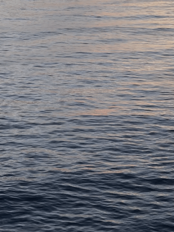
connecting • outside • nature
In the past, cities were the major hubs for innovation and attracted the young, entrepreneurial community. Present, consumer trickle out of the cities in search of a more natural, balanced lifestyle. There’s the need for beauty based on natural, organic ingredients that don’t harm the skin or the earth.
With the idea of bringing the outdoor-indoor, this bath product line for Morton Salt; there’s an opportunity to create a environmental experience with its’ packaging, from the buying, using, to having it place in ones household. Using pigment and textured to also emphasize tactility and invite touch.
/key attributes

/urban

/whole
centered

/playful
/reflective
/serene
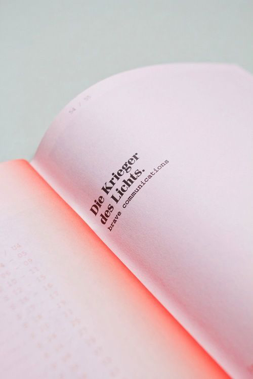
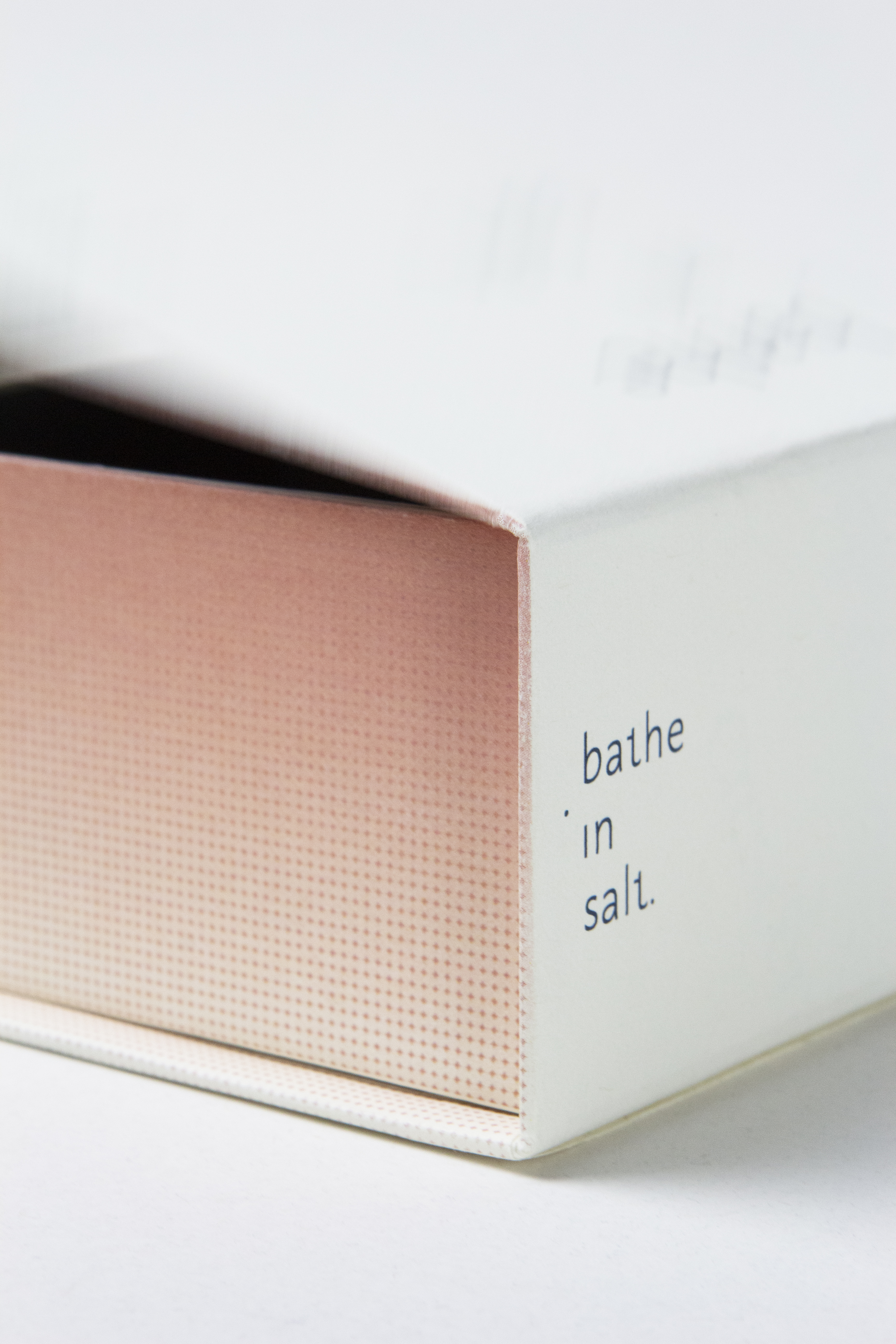
/new logotype
(brand identity)
Bathe in salt is a sub brand for Morton Salt. Focusing on the bath line market like shampoo, soap, scrub, etc. The logo ‘bathe in salt’ as a verb, an action-tense; gives you a sense of balance and serene ritual of when taking a bath with salt. The logotype adds playfulness with the use of a little salt grain, extracted by the dot of the ‘i’ used in the word ‘in.’
![]()
(brand identity)
Bathe in salt is a sub brand for Morton Salt. Focusing on the bath line market like shampoo, soap, scrub, etc. The logo ‘bathe in salt’ as a verb, an action-tense; gives you a sense of balance and serene ritual of when taking a bath with salt. The logotype adds playfulness with the use of a little salt grain, extracted by the dot of the ‘i’ used in the word ‘in.’
/color
![]()

/typeface
![]()
/graphic application
Inspired from the abundant amount of salt, the dots used for the application is the representation of salt. With the usage of gradient inspired from the sun, ocean, and sky, the usage of colors are pigments from nature, reminisenting it. Colors will then reflects creating an environment beyond the packaging itself. Feel and look created by grains of salt.
![]()
![]()
Inspired from the abundant amount of salt, the dots used for the application is the representation of salt. With the usage of gradient inspired from the sun, ocean, and sky, the usage of colors are pigments from nature, reminisenting it. Colors will then reflects creating an environment beyond the packaging itself. Feel and look created by grains of salt.

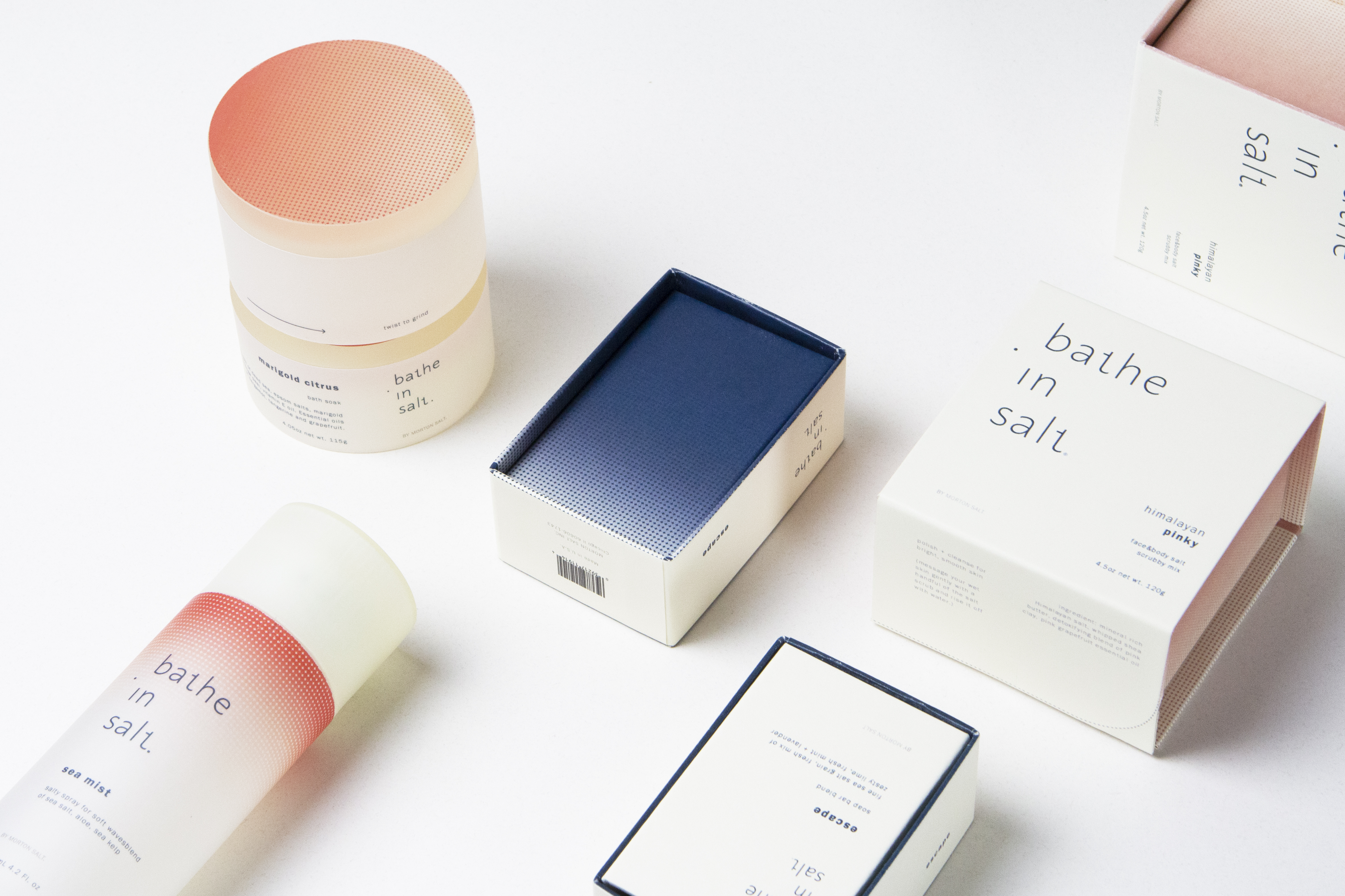
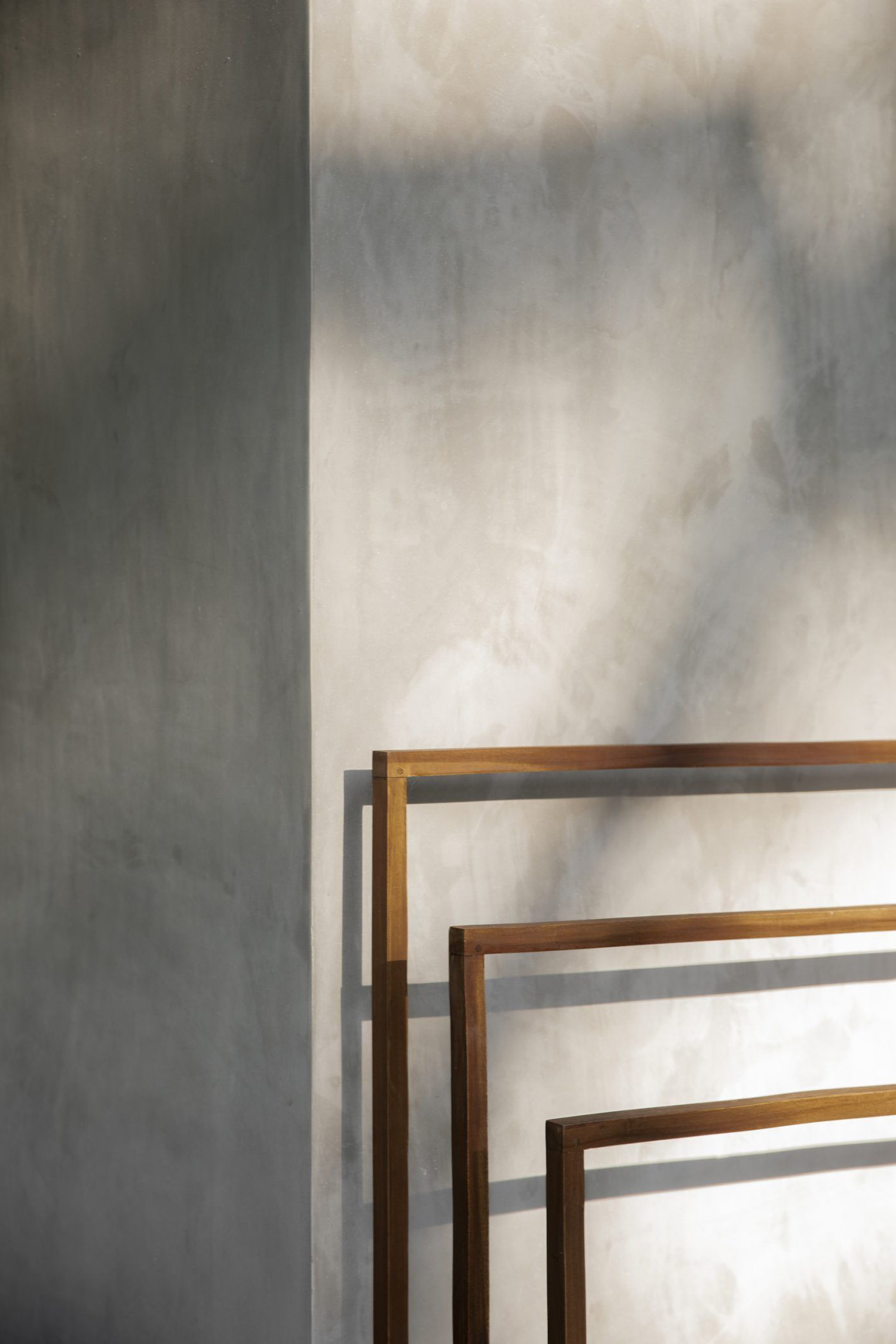
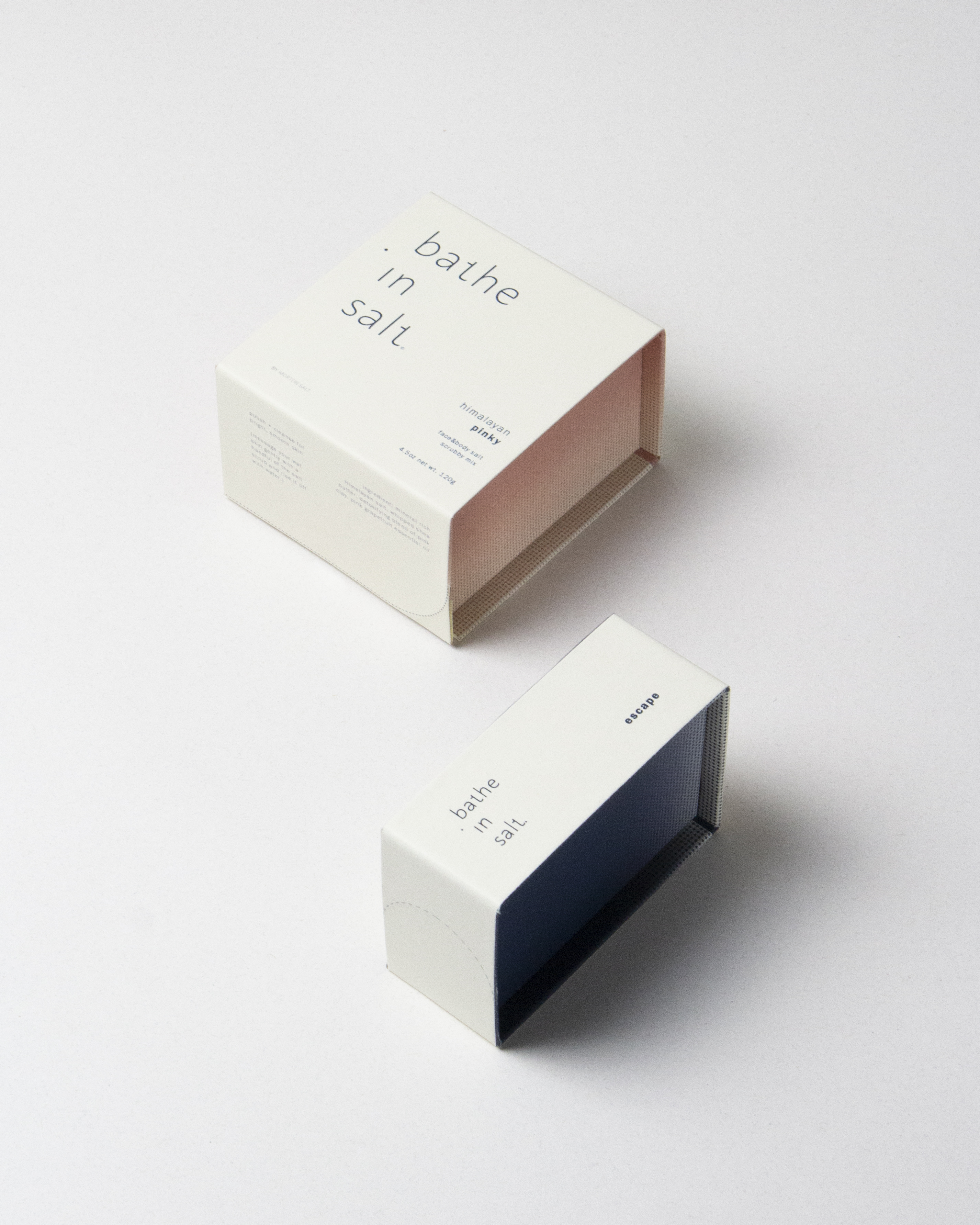
/final packaging
![]()


(form development)
/urban rectangle&square
Inspired by the architectural stucture that is embedded within a natural environment. As well as looking at architectural form and proportions.
Architectural form is very structural, where as nature is more more organic. Simplifying the forms to a square and a circle. Applying that within the packing with rounded cut out for opening, creating little playful details for the opening ceremony.
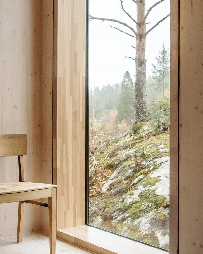
/connecting
Windows became the key aspect in connecting us to the outside world, to nature. Abstracting and inspired from the structure and strip of a window part in our household: creating an inward cut in aspect to the packaging structure.
![]()
Windows became the key aspect in connecting us to the outside world, to nature. Abstracting and inspired from the structure and strip of a window part in our household: creating an inward cut in aspect to the packaging structure.


/‘creating an environment with its’ packaging’
reflective element with the usage of color, light and placement.
gradient and reflection: creating an environment with various pigment, just perfect for the side of your bath tub.
reflective element with the usage of color, light and placement.
gradient and reflection: creating an environment with various pigment, just perfect for the side of your bath tub.
/The family include packaging for:
![]()
![]()
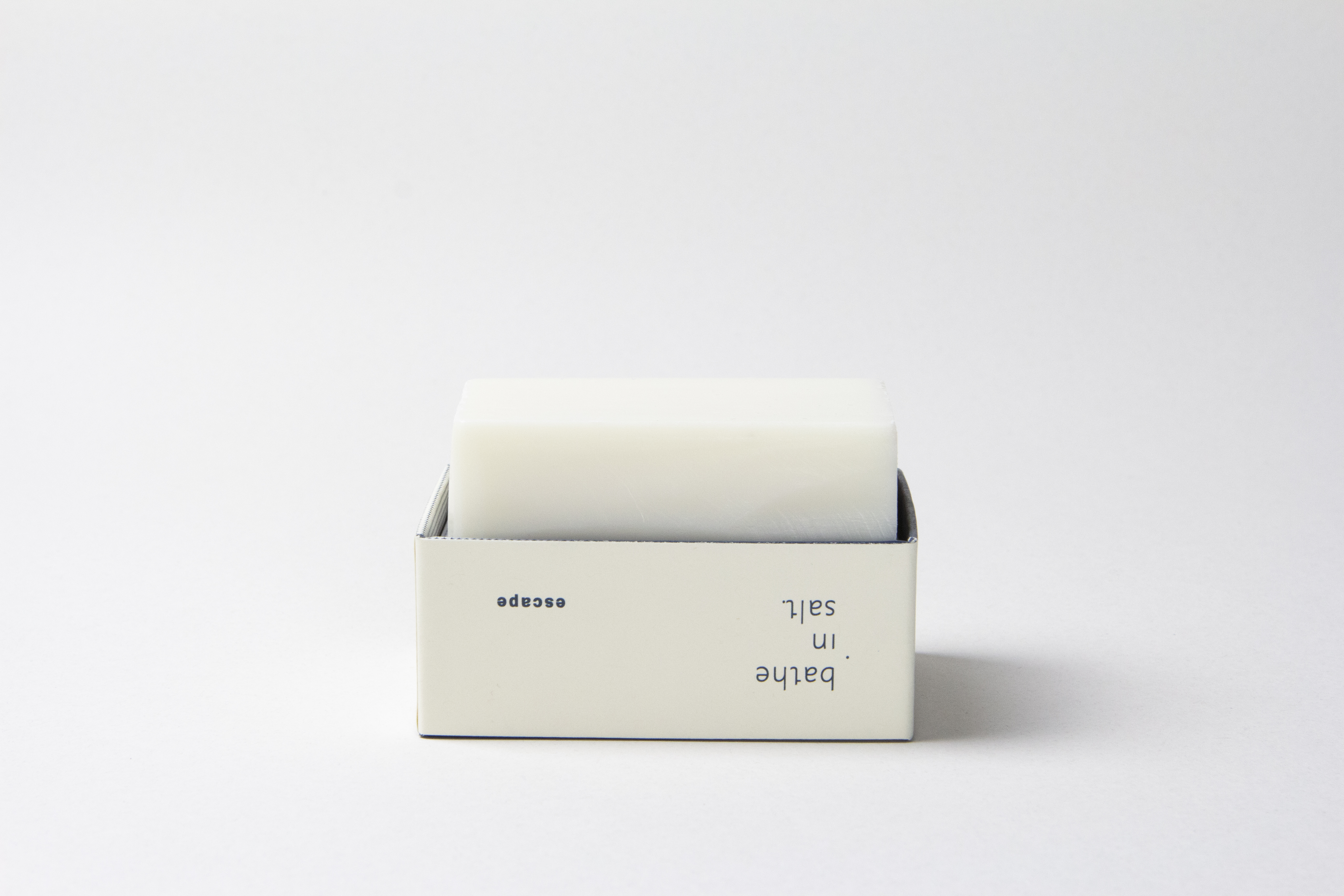
/soap bar, package can be use as a soap tray
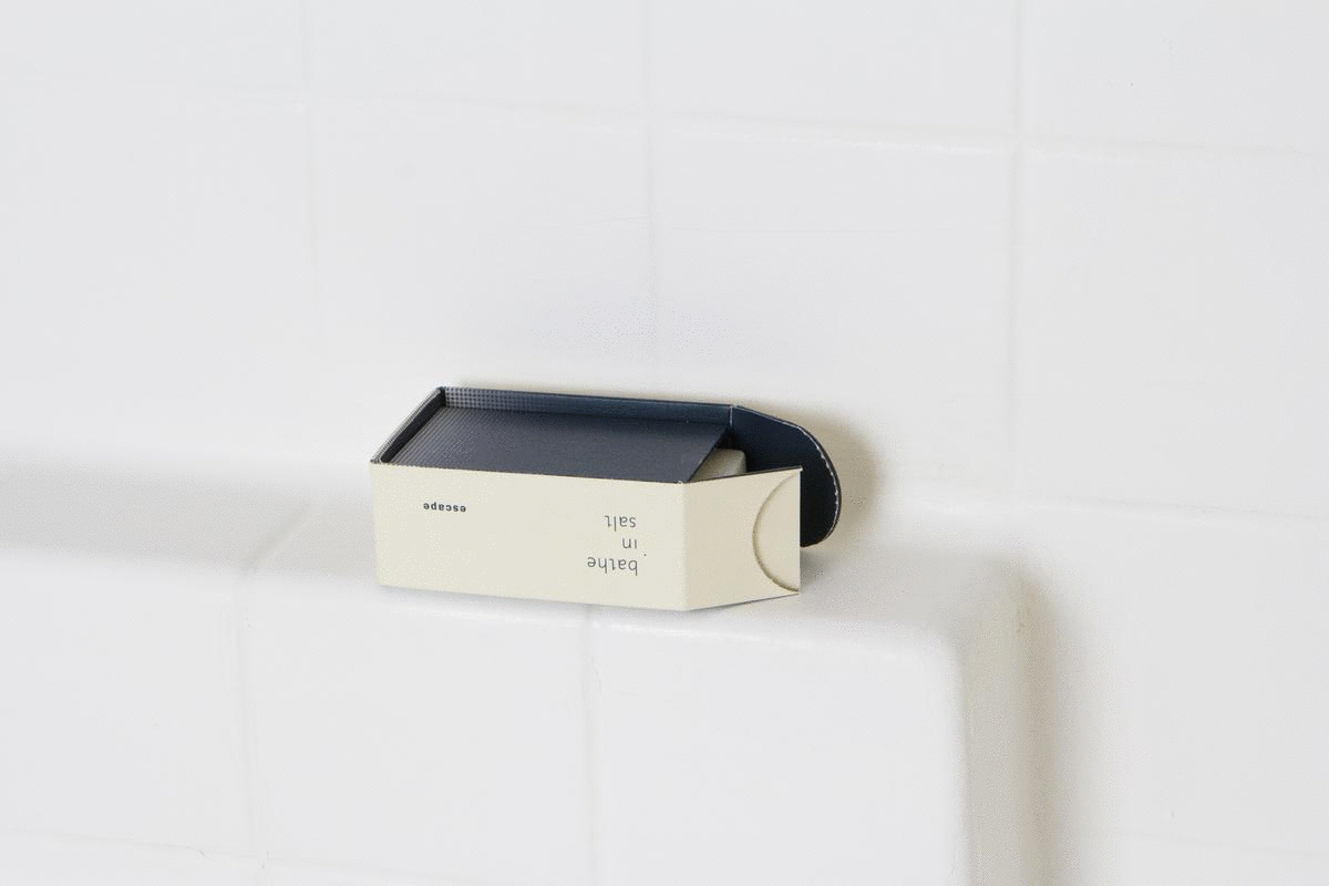

/soap bar, package can be use as a soap tray
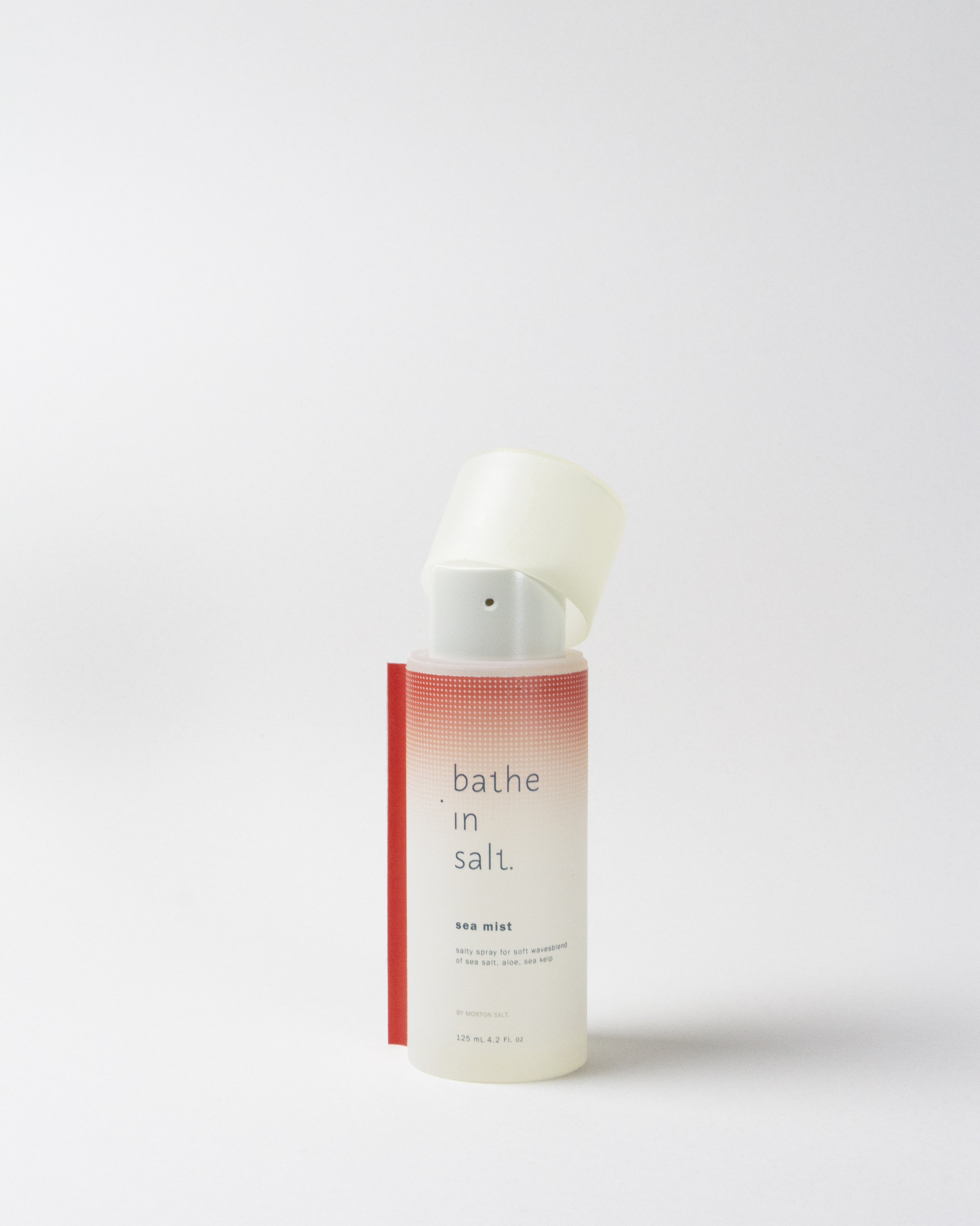
/sea mist spray

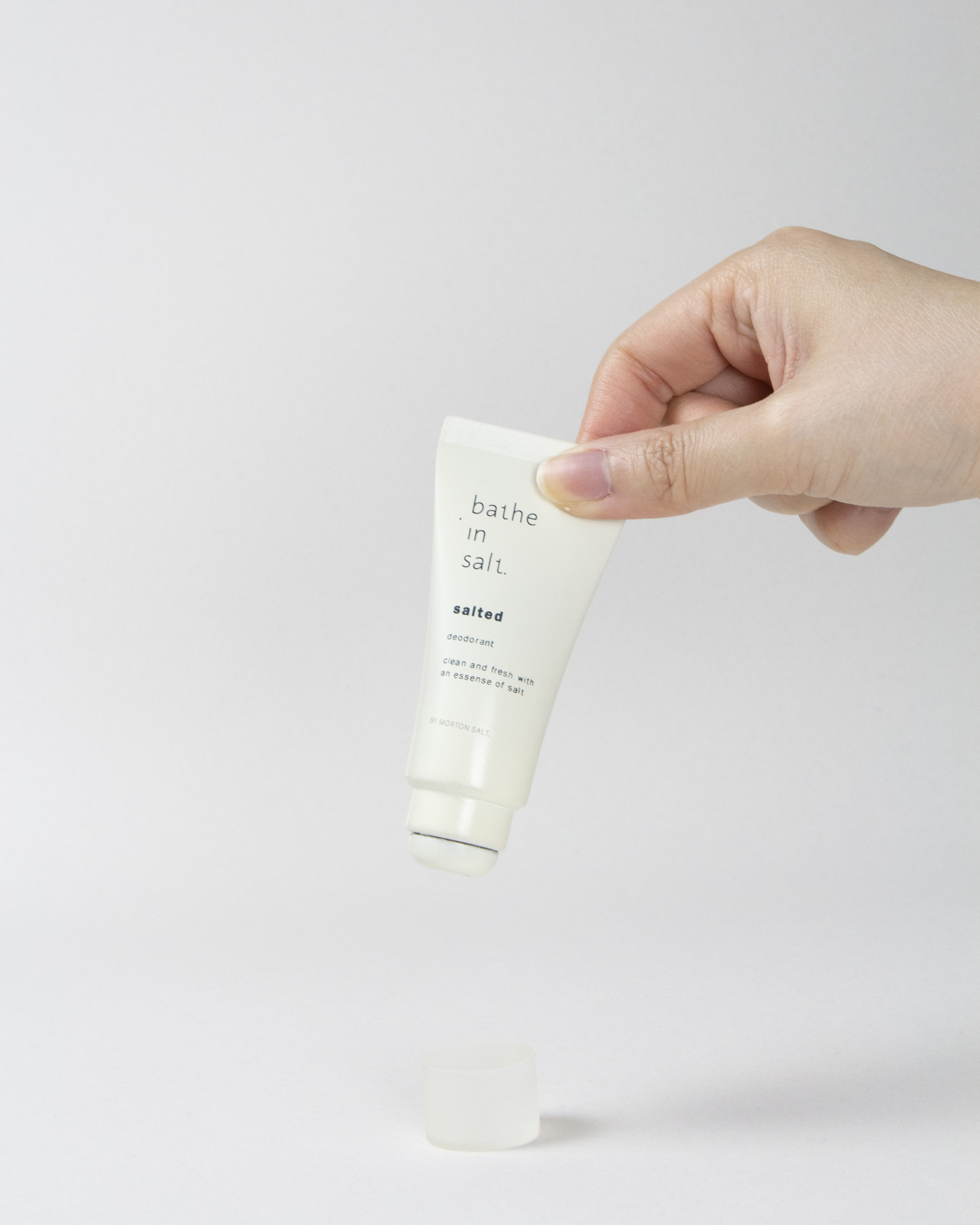
/salted deodorant, travel size & bath scrub

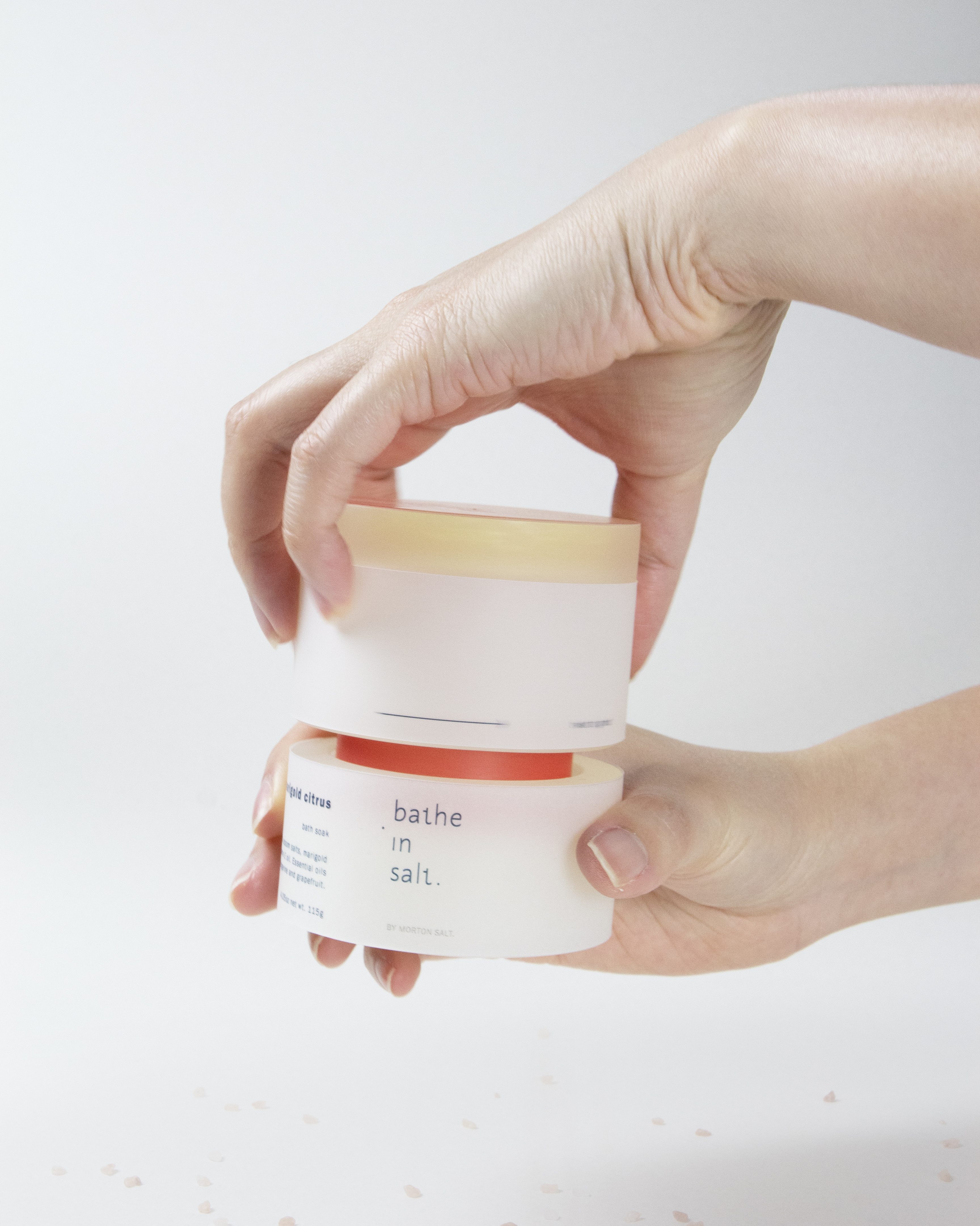
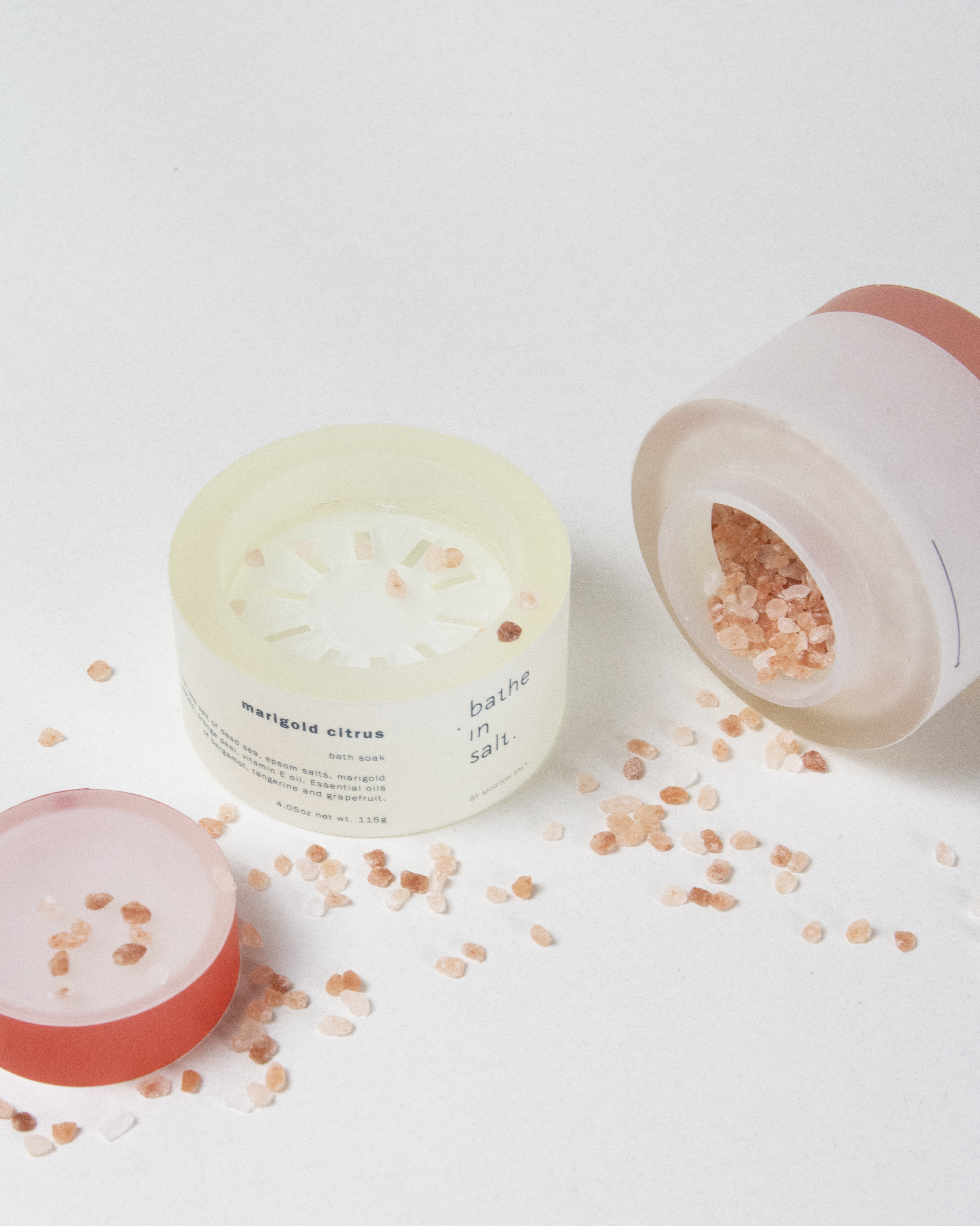
/salt bath soak
package to create a new ritual in ‘griding’ salt grains into the bathtub for a consistance sprinkle of salt.


/poster application
a round embossed circle made from thousand dots of salt grains, blending into a space, an environment. Giving an inviting sense of touch with its’ texture and serenity with its’ subtle nude colorway.
(This project has no direct affiliation with the brand)
Copyrights © 2022 Proud Karnchanapimolkul - All rights reserved.